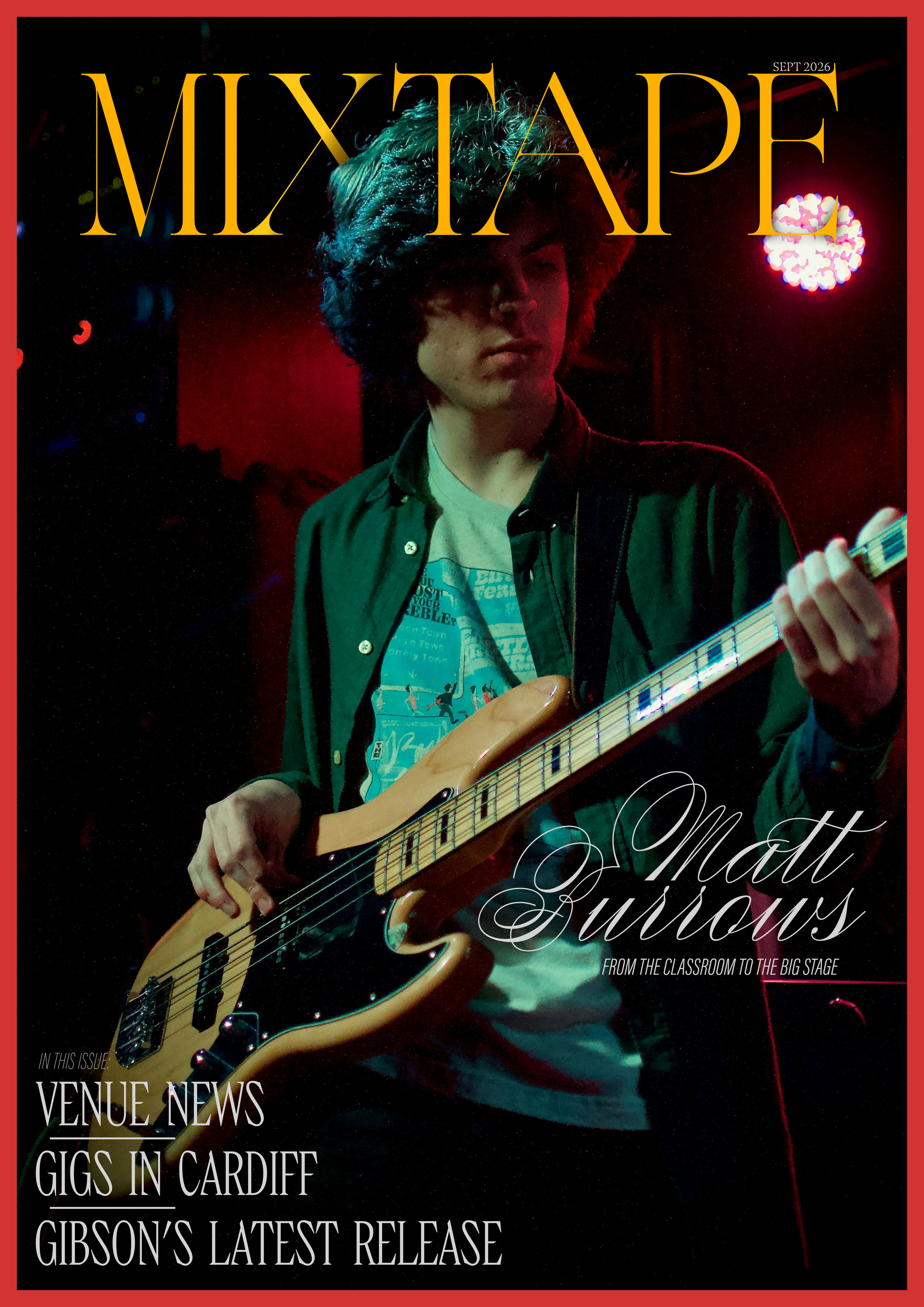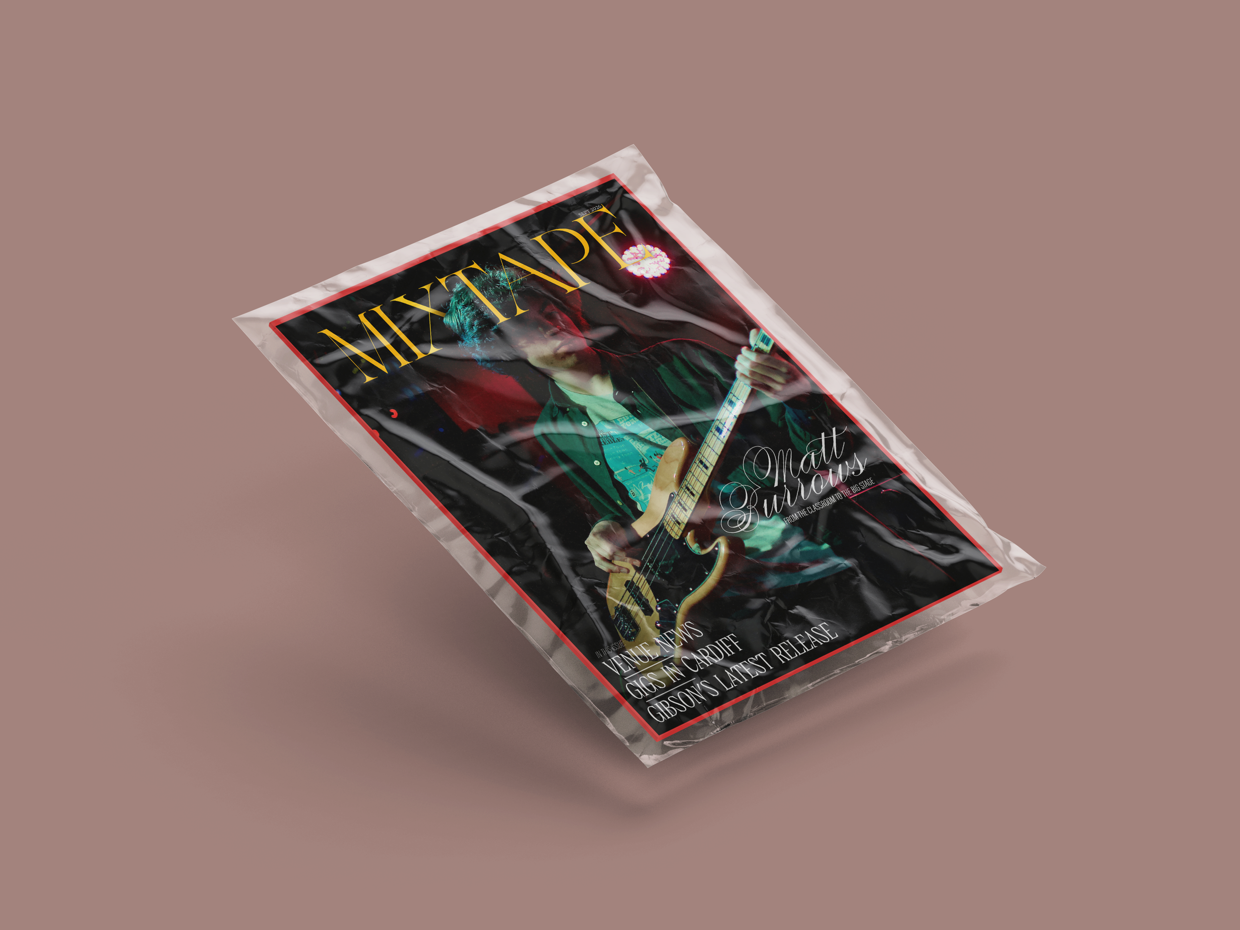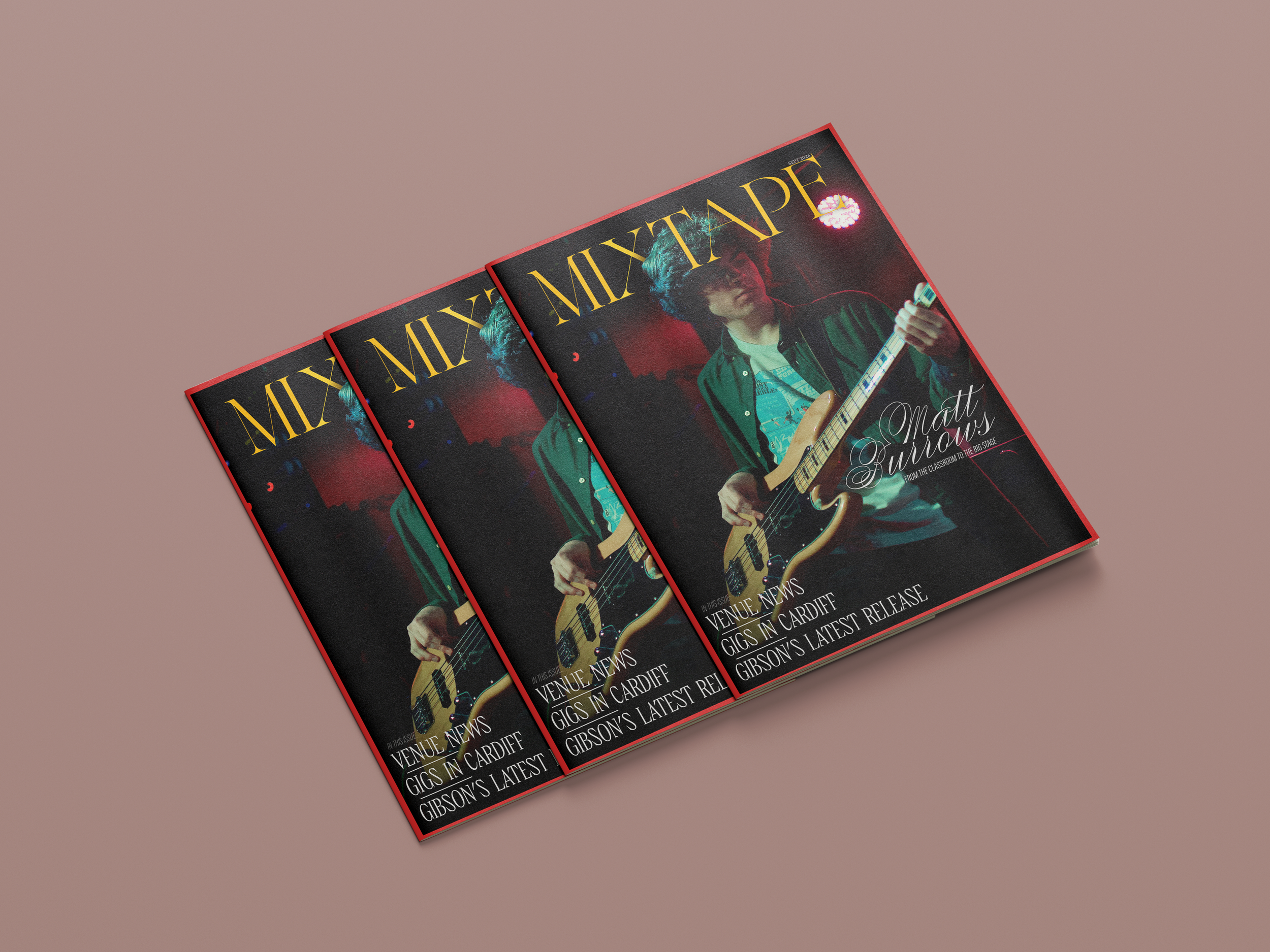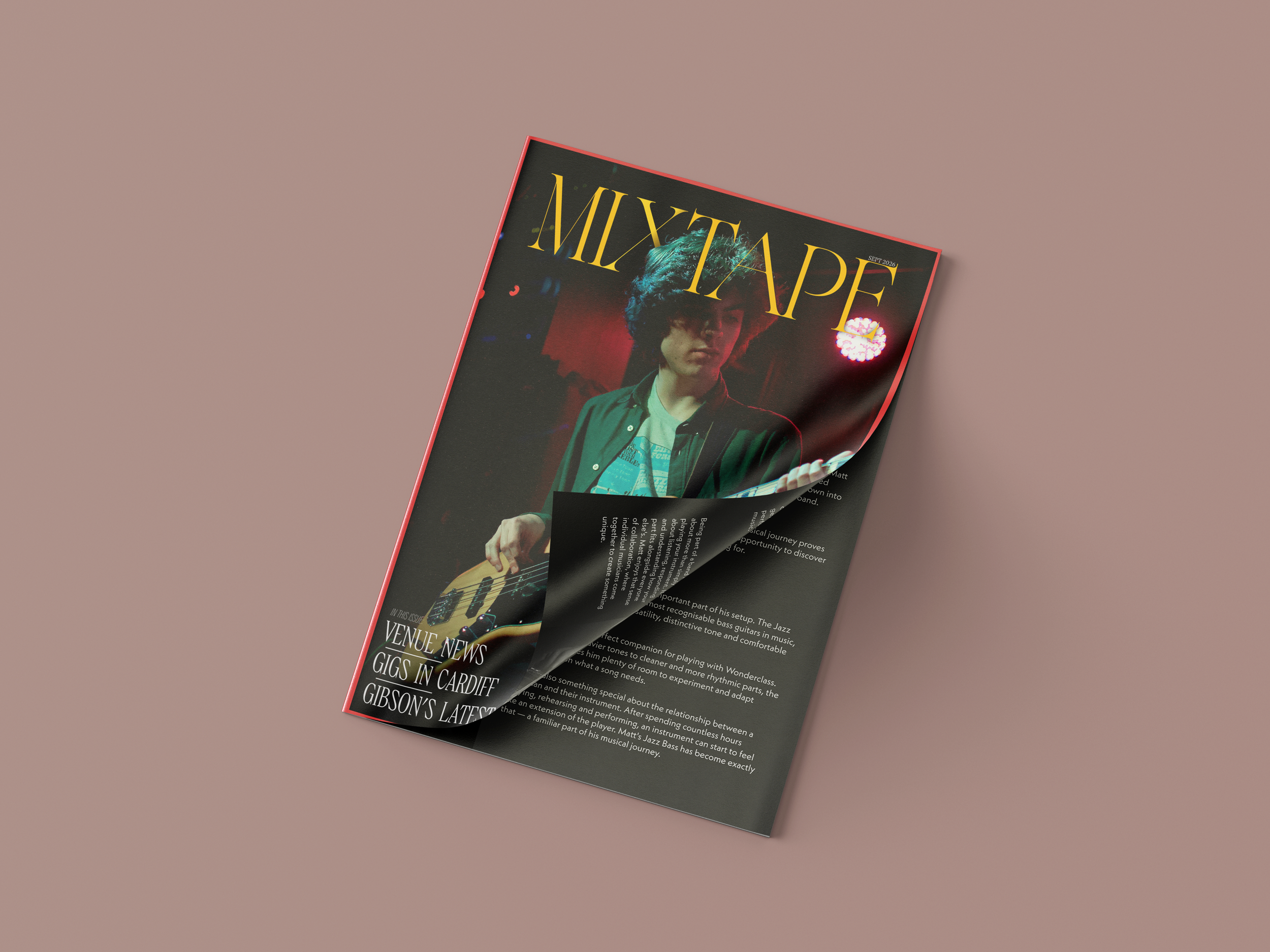
a small local zine showing news in the music industry, upcoming gigs and exclusive interviews.
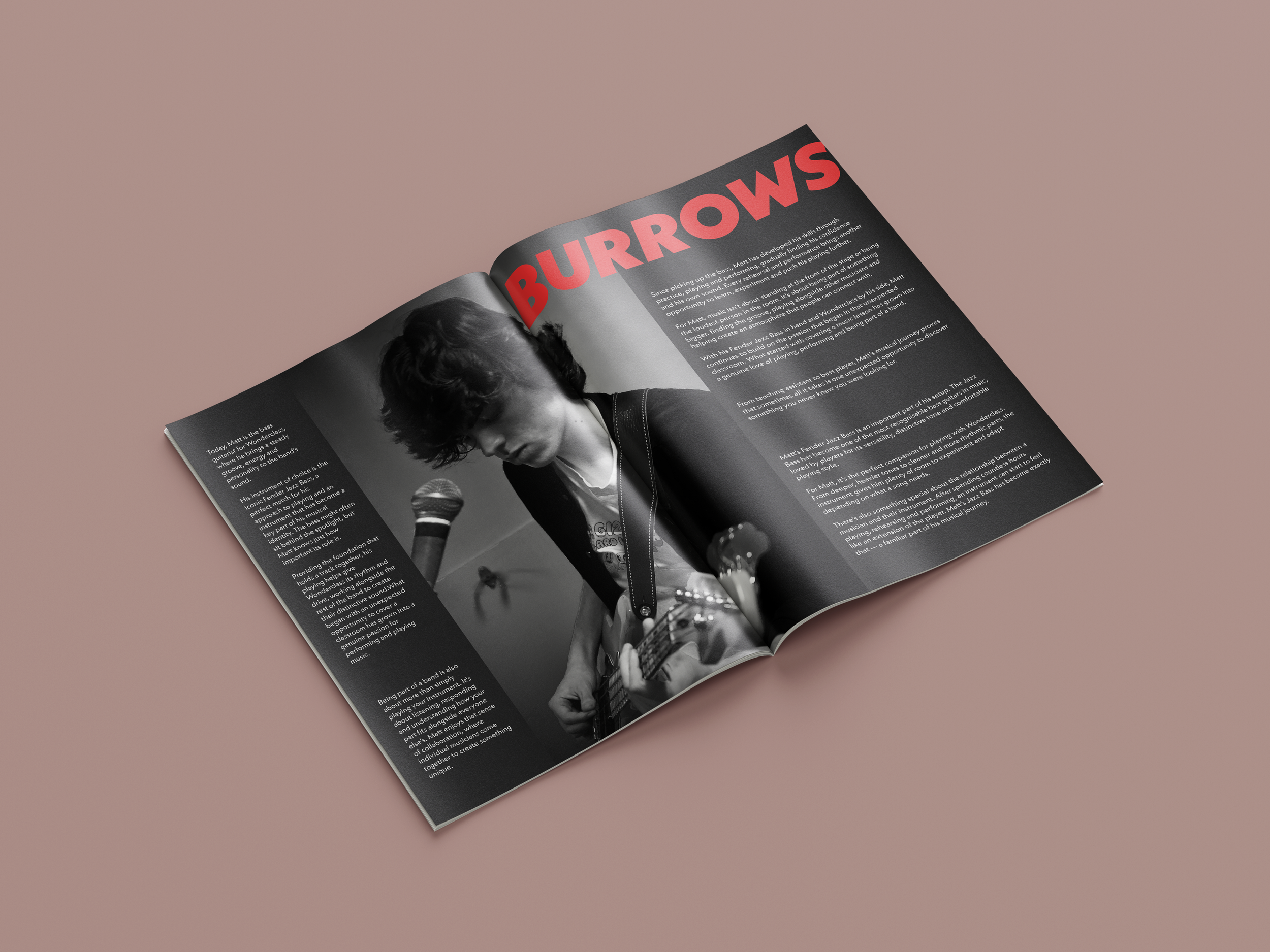
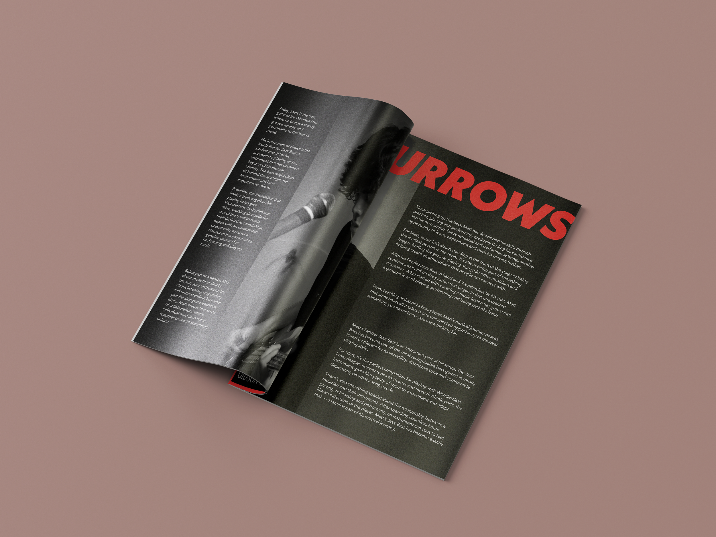
the opportunity to design the front cover and the main double page spread offered new challenges in print design.
The goal
Create a striking front cover that uses bright colours despite the use of multiple colours in the cover image. Also requires a full double page spread in the middle of the zine for the feature story.
The approach
A standout red border helps separate the zine on a stand with a plethora of different publications. Dynamic typography with the zine’s logo helped keep the front cover feel less static, in line with the image’s subject.
The double page spread’s negative space was able to breath more with the inclusion of the overlapping title and use of white text on a black background.
Results
September 2026 is the 3rd highest selling edition of the zine. I think this is down to the addition of the brighter colours added (they usually have a black or white border & a dull yellow logo). The double page spread also saw positive reactions online from readers.
21%
+ edition readers
37%
+ online traffic
860
+ copies sold